iPhone Interface Elements
My notes from the iPhone Human Interface Guidelines.
Toolbars
- actions users can take in the current context
- provides functionality within the context of a task
- hit-region of a user interface element is recommended to be 44 x 44 pixels
Tab Bars
- A tab bar gives users the ability to switch among different modes or views in an application, and users should be able to access these modes from everywhere in the application
- Displays 5 or fewer tabs. More Tab is display on 6+
- When an application has more than five tabs, users can select their favorite tabs to display in the tab bar
Alerts
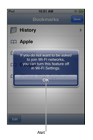
- Alerts give users important information that affects their use of the application (or the device). Alerts are usually unexpected, because they generally tell users about a problem or a change in the current situation that might require users to take action.
- An alert that contains three or more buttons is significantly more complex than a two-button alert, and should be avoided if possible. In fact, if you find that you need to offer users more than two choices, you should consider using an action sheet instead
Action Sheets
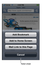
- Displays a collection of alternatives that are associated with a task users initiate by tapping a button in an application’s toolbar
- Get confirmation before completing a potentially dangerous task.
- If you need to provide a button that performs a potentially destructive action, such as deleting all the items in a user’s shopping list, you should use the red button color.
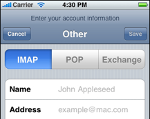
Modal Views
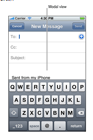
- A modal view slides up from the bottom edge of the screen and always covers the entire application screen
- A good example of a modal view is the compose view in Mail. When users tap the Compose button, a modal view appears that contains text areas for the addresses and message, a keyboard for input, a Cancel, and a Send button.
- In a modal view, you can use whichever controls are required to accomplish the task. For example, you can include text fields, buttons, and table views.
Table Views
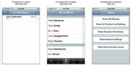
- Left – Simple List in a Regular Style Table View
- Left – The disclosure indicator element is necessary if you’re using the table to present hierarchical information. This is because users know that this element means “show the next page of information.” It should appear to the right of every list item that contains a sublist of items.
- Middle – Indexed list in a Regular Style Table View
- If you want to display a list of items divided into sections, you can configure a regular table view to display section headers, with each header describing a section and providing visual distinction from the other sections.
- Right – Grouped List in a Grouped Style Table View
Text Views
- A region that displays multiple lines of text.
- Inherits from a scroll view, which means that the text view supports scrolling when the content is too large to fit inside its bounds.
- Support user editing. If you make a text view editable, a keyboard appears when the user taps inside the text view.
Web Views
- Region that can display rich, HTML content in your application screen.
Activity Indicator
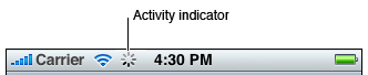
- The “spinning gear” appearance of the activity indicator shows users that processing is occurring, but does not suggest when it will finish.
- By default, an activity indicator is white.
Normal Picker
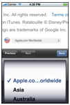
- Display any set of values
- Values in a wheel are hidden from the user when the wheel is stationary
Date and Time Pickers
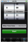
- Can have up to four independent spinning wheels
Info Buttons
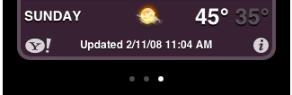
- Provides a way to reveal configuration details about an application, often on the back side of the screen.
- Suited to utility applications
Page Indicators
- Displays a dot for each currently open view in an application (See weather app image above)
Progress Views
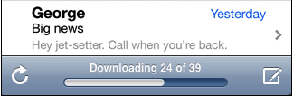
- Shows the progress of a task or process that has a known duration
Search Bars
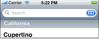
- When the user taps a search bar, a keyboard appears; when the user is finished typing search terms, the input is handled in an application-specific way.
- Placeholder text.
- The Bookmarks button.
- The Clear button.
- A descriptive title
Segmented Controls
- A linear set of segments, each of which functions as a button that can display a different view
Sliders
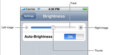
- Allow users to have fine-grained control over the values they choose
Switch Controls
- See auto brightness switch control image above
- Presents to the user two mutually exclusive choices or states, such as yes/no or on/off.
Text Field
- When the user taps a text field a keyboard appears; when the user taps Return in the keyboard, the text field handles the input in an application-specific way.
- Comes in bordered or plain style
- For a complete list, go to Apple’s Documentation on System Generated Controls
Launch Images
- Measures 320 x 480 pixels.
- Name your launch image file Default.png and place it at the top level of your application bundle.
Application Icon
- Measures 57 x 57 pixels.
- Does not have any shine or gloss.
- Name your icon file Icon.png and place it at the top level of your application bundle.
Custom Icons
- For toolbar and navigation bar icons, create an icon that measures about 20 x 20 pixels.
- For tab bar icons, create an icon that measures about 30 x 30 pixels.
- Use the PNG format.
- Use white with appropriate alpha and no shadow.
- Use anti-aliasing.